Worst Cover Art
of 2006
Quick links: Top 5 DVDs | Most Anticipated Albums of 2007 | Reasons The Fresh Prince was awesome | Top 5 Singles | Big Comebacks of 2006 | Top 5 Shows | Top 5 Things That Sucked | Top 5 Things That Ruled | Noteworthy Songs | Top Reissues | Reasons the BBC Is Killing UK Music | Top 5 Vinyl-Only Releases | Worst Cover Art | Band Tour Stories
Album artwork in 2006 has truly jumped the shark. Even saying 'jumped the shark' has jumped the shark. Linguistic cliches aside, this year has shown us a new range of anti-quality in record cover art, and I, your loyal correspondent, shall now attempt to introduce some of the groups in 2006's bad record covers.
The Predictable Cover Art
The feeblest kind of cover art is the kind that you can envisage before you've even seen it. You know the type, it's usually a staple of generic hardcore bands, or unimaginative metal combos who plaster an evil-looking skull on the cover with the band name written in gothic-esque lettering, or even in blood. As an introduction to the category, here are just two of the many, many predictable record sleeves of 2006:
Lostprophets - Liberation Transmission

Not only are Lostprophets ripping off Sick Of It All's logo, they're also quite happy to plunder wholesale the whole cheesy concept of blood spatters on the cover. Along with the record name, is this supposed to illustrate how tough the band are? This just in: latin mottos were so 2000 BC. Ab irato.
Cannibal Corpse - Kill

If you didn't picture this record being red, unsubtle and written in that completely-underused distorted font style, you're probably a zombie yourself. With a band and record name like this, would you really expect anything less?
The "Check Us Out, We're Hot Musicians" Cover Art
Traditionally the pursuit of boybands and "singer songwriters", the emotional portrait style of cover art tends to be aimed at the exploitable teenage girl market, traditionally viewed as easily swayed by a cute guy with an acoustic guitar and some 'dangerous' stubble. This is risky territory for a rock band, most of whom would be the first to deny any accusations of posing. However, the examples below are not afraid to show their group style and tough-but-sensitive posturing.
Dashboard Confessional - Dusk and Summer

Chris Carrabba: modern emo's poster boy. Coner Oberst haircut? Check. Downcast melancholy eyes? Check. Emotional, evocative beach scenery? Uh, check. Just try not to imagine Jack Johnson popping out from behind a surfboard with his brand of feelgood guitar pop and the picture of pained vocals and heartfelt guitar chords is complete.
Razorlight - Razorlight

You can almost imagine how pissed the three guys on the right were when Mr. "Too Good For White Shoes" on the left showed up to the photoshoot. Or perhaps they weren't; maybe his individuality would express the band's own 'crazy' edge. In Razorlight's world, not everything is black and white. Except it is.
The Bright Yellow Silhouette Cover Art
For such a poor design, it's bizarre that more than just 1 band made this mistake in 2006. I can't think of any reason for these 10-minute Photoshop jobs besides an urgent printing deadline or shortage of graphic designers. Either way, somebody needs to tell these guys that bright yellow is never a choice when you're attempting to sell a product.
Hard-Fi - Stars of CCTV

Ah, a surveillance camera. Or a malnourished robot about to squeeze some ketchup onto his fries. The camera's tantalising position implies that something more exciting than the cover art itself (yeah, I know!) is happening just out of viewing range. If only Hard-Fi would tell us what.
NOFX - Wolves in Wolves' Clothing

Using almost the exact ugly shade of yellow as Hard-Fi above, NOFX manage to make a vaguely more interesting attempt that is still one of the most boring ideas ever. Would a little blood have hurt, guys?
The Spooky Location Cover Art
Ahh, the spooky location. Usually reserved for metal bands, this tends to take the form of a deserted location, often a spooky-looking graveyard, church, abandoned warehouse or reclaimed cheese factory. In the instances below, each band chose to represent a lonely, grey location, which says little for their music.
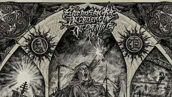
Eyes of Ligeia - A Fever Which Would Cling to Thee Forever

The grainy nature of the image here annoys me, partly for its similarities to the TV in The Ring. The "eerie-looking" figure on the right is more comical than scary; akin to Gandalf of Lord of the Rings fame in his nightwear. The real question here is how Gandalf managed to get down the stairs on the left, given their M.C. Escher-esque shape.
Harvey Milk - Special Wishes

While Jimi Hendrix is not normally associated with spooky shacks, Harvey Milk's bare-looking room is just boring. The washed-out greyscale and uninteresting setting just succeeds in making me want to play some Hendrix even before I open the CD case of Harvey Milk.
Jesu - Silver

A tree. Not even a special tree, or a tree with a kickass evil face and shit. It seems to be a pre-requisite of this category that all colour is evaporated from the image, which obviously increases its spooky factor by 247%. Since the band felt adding their name to this cover would spoil the scariness, we're left merely with the tree itself to contemplate on. I guess Jesu should have... branched out, right?
The Minimalist Cover Art
Alternate title: "The Lazy Graphic Designer Cover Art".
Some bands treat their record cover as the only chance to express their artistic vision in a visual medium. Since music is currently only available in the aural form, many bands relish the chance to give their work a tangible representation, and spend long hours choosing designs to represent their work. However, some bands clearly do not share this feeling. For them, cover art is apparently a last-minute throwaway deal that is just like Christmas wrapping paper. Let's unwrap:
108 - Creation. Sustenance. Destruction.

You'd think that with a bandname as nondescript as 108's, they'd go to extra effort for the cover. Nope. The Beatles already made the White Album, so this effort is not only boring, but redundant. The vague hint of a square outline is like a desperate cry for creativity from the designer, clearly forbidden from engaging in any creativity beyond 2 colours.
Constants - The Murder of Tom Fitzgerril

This might be an EP but that doesn't mean you can only put in a quarter of the effort on the cover front. Slight bonus points for attempting some photography along the bottom, but overall this just smacks of wasted potential.
Bomb the Music Industry! - Goodbye Cool World

I guess Jeff Rosenstock is devoting so much of his time to destroying the system from within that he has no time for trivialities such as album artwork. Despite some pretty awesome (non)business practices, that doesn't excuse him from phoning it in with this sleeve. I'm impressed at least with the use of some actual colour, but that doesn't save this record from minimalist hell.
Jawbone - Hauling

I'm not certain about the US, but over here in the UK there is a brand of toothpaste called Aquafresh. The toothpaste's main feature is its distinctive red, white and blue stripes (presumably a co-incidence and not some patriotic lameness). Combine this with Jawbone's name and we have a new genre: dentalcore. This album cover is as exciting as a root canal.
The Just Plain Bad Cover Art
Some album sleeves don't fall into any discernable categories, they just suck. Of the many choices available, here are just 5 which scrape the bottom of the barrel.
Soul She Said - As Templar Nites

Any record whose main feature makes my head begin to ache is not cool, especially when its main colour makes me think almost exclusively of gums.
Mastodon - Blood Mountain

Kudos to Mastodon for using a blue reindeer rather than a devilish-looking goat, but this is still a little too "out there" for my personal preference. Now, if this was an actual mountain made of blood, then we could talk.
Angels and Airwaves - We Don't Need to Whisper

Ah yes, the old "Earth in a cube" trick. I saw David Blaine do it. But guys, we don't need to whisper. Tom DeLonge is capable of much greater feats than merely moving the Earth. Just wait and see.
The Mars Volta - Amputechture

It wouldn't be a SPB Worst Cover Art list without the Volta making an appearance. While not as bad as their previous outings, this one is still pretty damned awful and the only thing I can get from it is that Omar and Cedric have had to hire several staff simply to support their increasingly-oversized heads.
AFI - Decemberunderground

Carrying on a half-noted mention of "rabbits are roadkill" scribbled in the Sing The Sorrow booklet, AFI have decided to turn the phrase on its head by creating some kind of rabbit-based wheel. The idea of a car powered by this method of locomotion is both terrifying and absurd, not least when set against some inverted forestry.
(Matt)


