
Maria (Sacrosanta Decadencia Occidental – vocals/artist)
SPB: The artwork of your album took over a year to make. What was this long experience like for you?
Maria: If I were to put it shortly, the first thing that comes to mind is a long and winding road: exhausting but exciting at the same time. It’s having multiple things roaming your mind, things that you feel strongly and that you want to express, while dealing with patience, resilience and frustration, because the idea is demanding and the cause it serves to, even more.
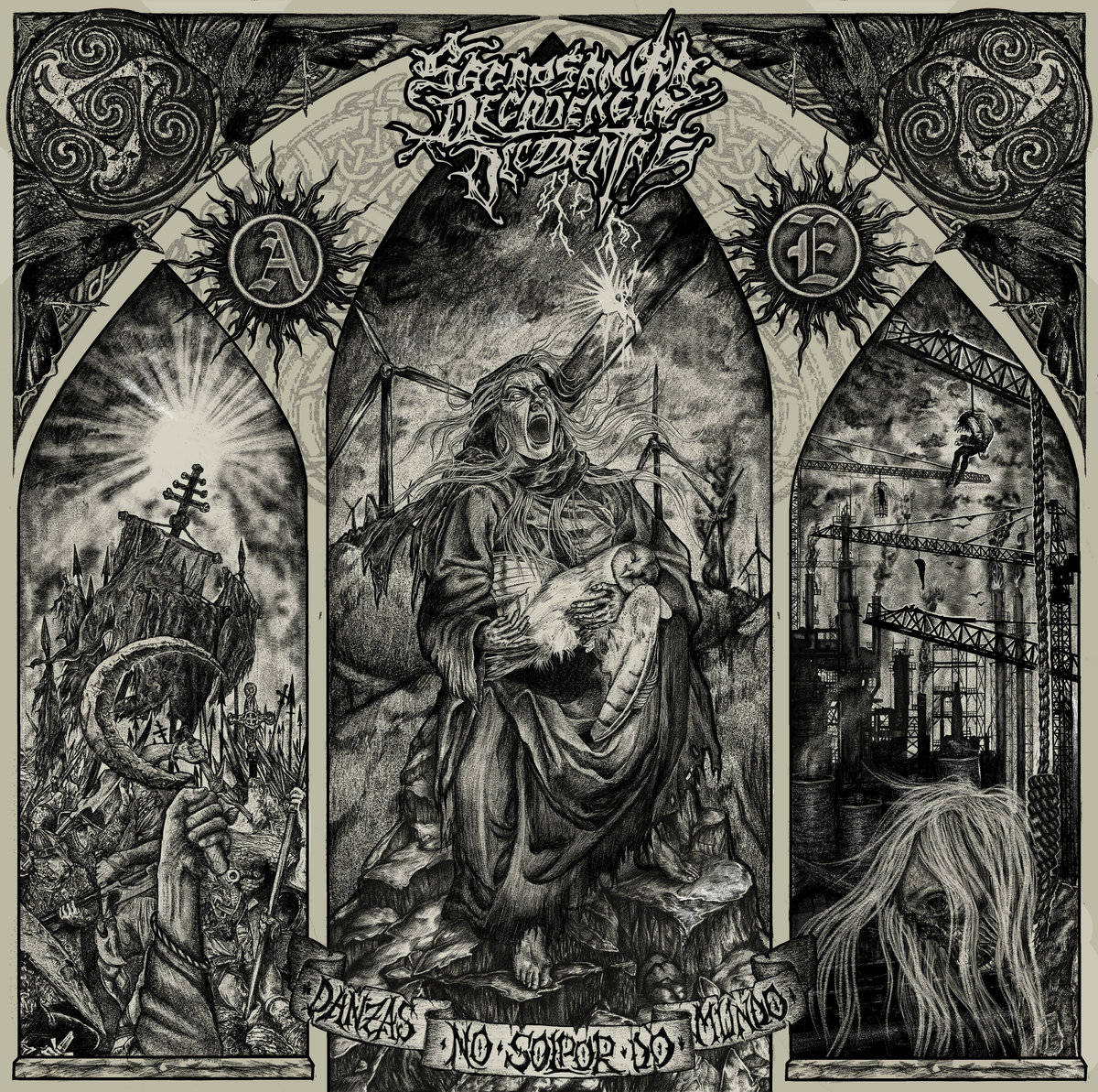
Originally, when we started working on the cover, the album was not even finished and we didn’t think of it as the album’s cover. It was conceived as an illustration to go with the track “As Fillas Da Néboa” and help the listener unveil the meaning of the song. We thought of making it into a poster, a T-shirt (or that’s what I told Edu, the guitarist of the band and other artist behind this album cover). And so I began shaping the centerpiece: the old lady with the barn owl between her arms. The sketch went through many different phases until we reached an approach that suited our idea, and from there I started sketching and shading, immersed in endless zooms.
This phase took months of work: the old woman, her wrinkles, achieving the expression of pain and -- at the same time -- rage (lots of stupid photos of my face grinning and gurning), all the furrows in her clothes, the barn owl’s feathers, one by one, studying dozens of references to understand how she would sit, the cascading of the clothes, the looks of a bird of prey already dead but in a semi-divine position that reminded -- together with the old lady -- of a Pietá and bathed the duo with the sensitivity of everything that is mystical, towering and supernatural. Everything took a lot of time because it needed lots of attention. Love needed to show in every detail, and there were lots of details, even if digital platforms have destroyed them.
The centerpiece for me is, ultimately, something that speaks about love. And love, in a world owned by the capital, egoism and violence, comes in the shape of pain and rage.
Once this (little, almost insignificant) part was over, we were left to deal with the background. Edu had already come to my help with the hands and the hood, and -- after days of frustration -- I decided that maybe this was a project that we were to overcome together. Both of us take to graphic design and illustration on our own, and we had already collaborated before, but it was always me in charge of illustrating and Edu in charge of colour, making it shine and finishing the design and layout work. A little more than a year after finishing the enormous project of this cover, I believe we make a good team when it comes to holding a pencil: he does landscape, while I take care of figures, the things in the front and faces, but both of us have ended up correcting and working over each other’s lines -- doing and undoing until madness -- in a canvas that was constantly but subtly changing.
When the album was mixed, we decided that the cover had to tell more things. The album was more complex, and there were things that we felt and needed to have a place in the eyes of the beholder. Edu thought about the three archways layout, and after long deliberation, we came up with the idea of the hangmen and the cranes (right archway) and the sickle amidst the battlefield (left archway). The first one drank from influences such as The Road from Cormac McCarthy (again an hours-long study of industrial landscapes, hanging bodies and decomposing faces). The second integrated the stone sickle emblem that we had designed and painted in one night (again, long and frustrating) over two cloth banners that we display in our shows. This was a more uplifting and instigating scene than the previous ones. In this archway there was strife; in the central one, love and in the right one; death, nothingness. Maybe defeat, an ending. Someone asked me a while ago if they spoke -- from left to right -- of the past, present and future… I had never thought of it like that, but it could be… Maybe we should turn our heads back to olden times, and remove the rust from our sickles before that rust gets in our skin too.
When we finished the three archways, after hours of drawing at home, at work, in the bars at night, during breakfast, in the car and in whatever imaginable little moment, there was only a day left until the date we had agreed to publish the album. And that was the least productive day of all. We were completely overworked and saturated, and everything we tried gave us the feeling of de-meriting the previous hard work. I remember we went to bed at 7:00 a.m. having lost all faith and nerve, and with a barely sketched-out idea. The following day all we did was to keep our eyes on the movement of the pencil over the screen with all zoom it could give us (because, to get the texture of a graphite pencil and work as if we were doing so with a real one, we were using the smallest and weakest trace available on our workstation). It was 20:15 when we finished and, about 21:00 -- because it took us our time to also write a proper text to go with the album cover -- we published our work.
Today, and despite the denseness of the process, I think this is the most important illustration in which I have worked -- the one that tells the most about me, and the one with which I have learned the most. It saddens me that -- without the exception of the close-ins we have uploaded to our respective portfolios -- we haven’t been able to post the image with all the quality needed to fully grasp the details, to any platform.

